Equalis Capital
Role: Creative Direction, Design
The Opportunity
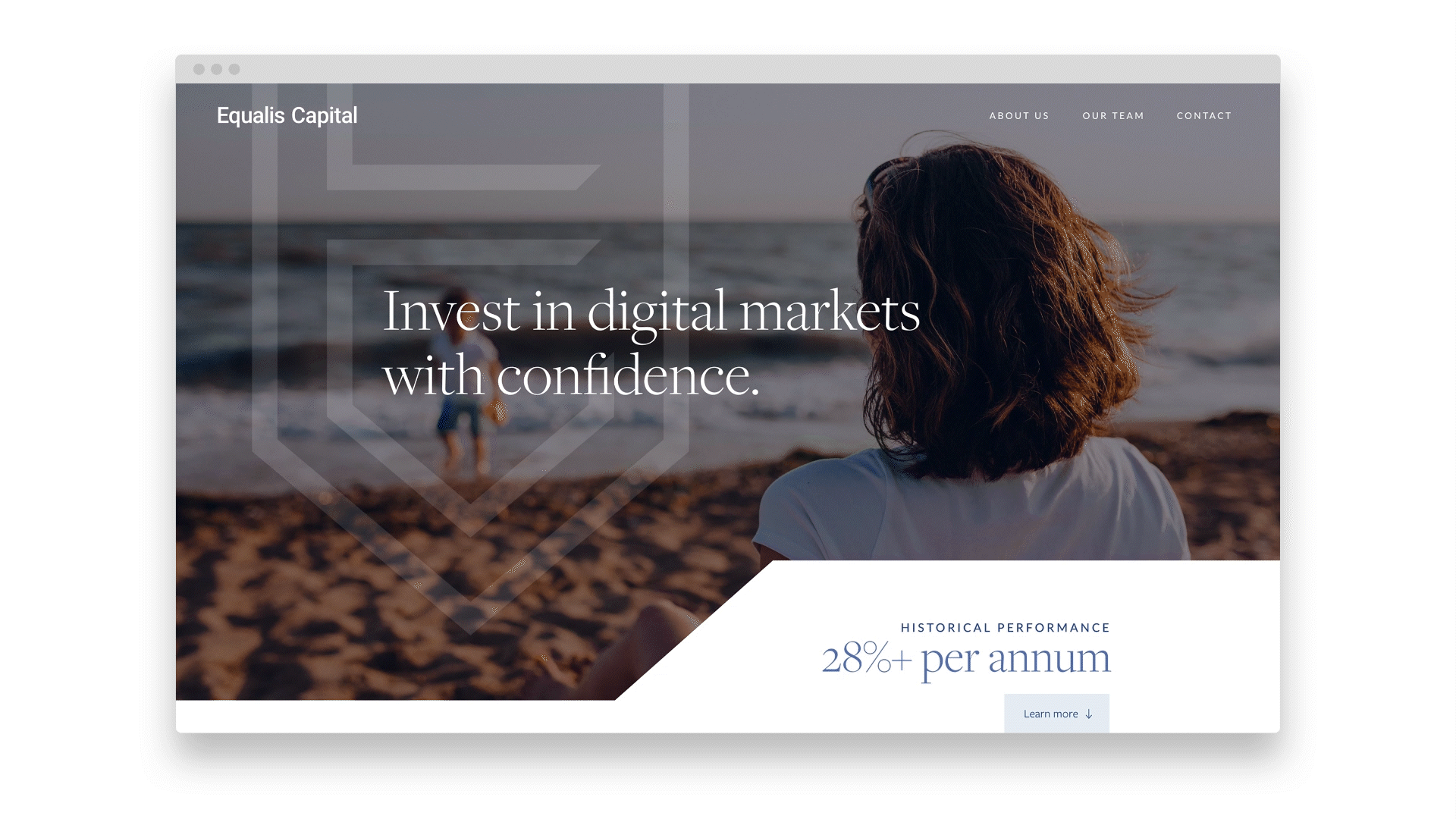
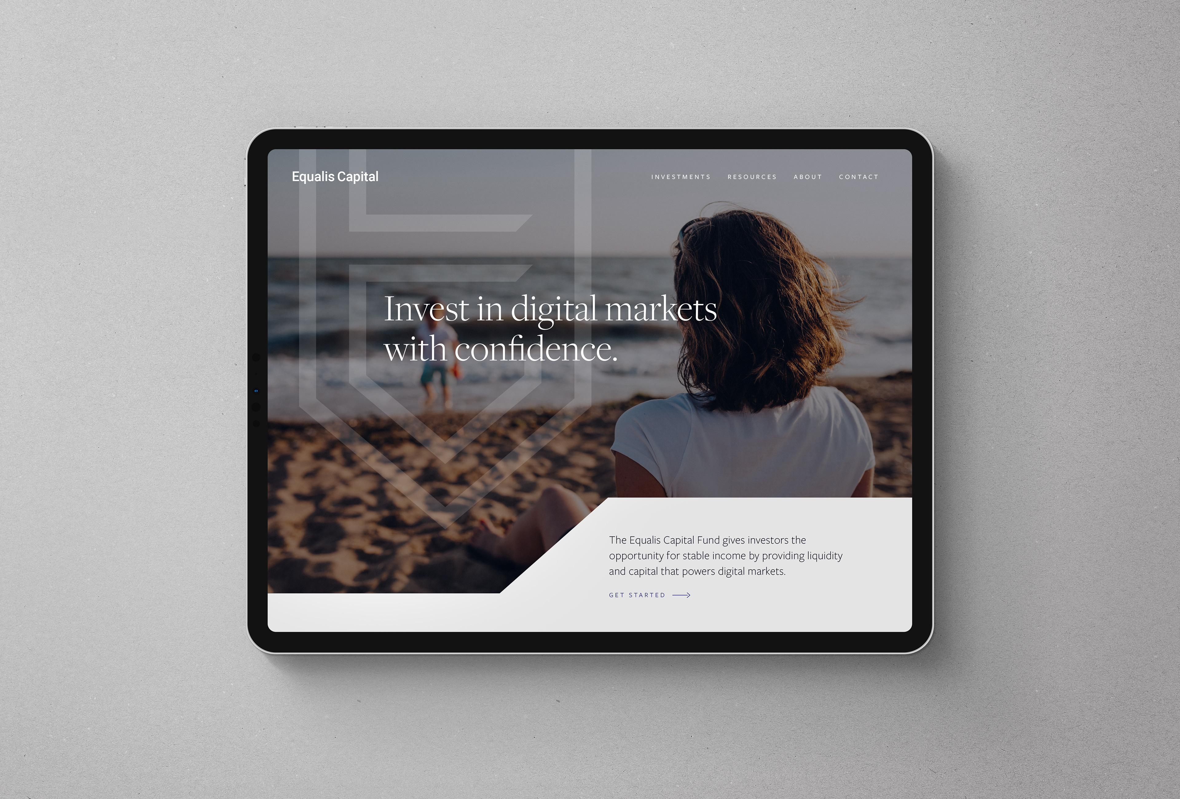
Equalis Capital—a FinTech investment fund company providing access to digital markets—needed a new brand identity to position itself as trusted, transparent and accessible for consumers, with the goal of becoming a digital market investment platform for not just high-income investors, but for everyone.
The Approach
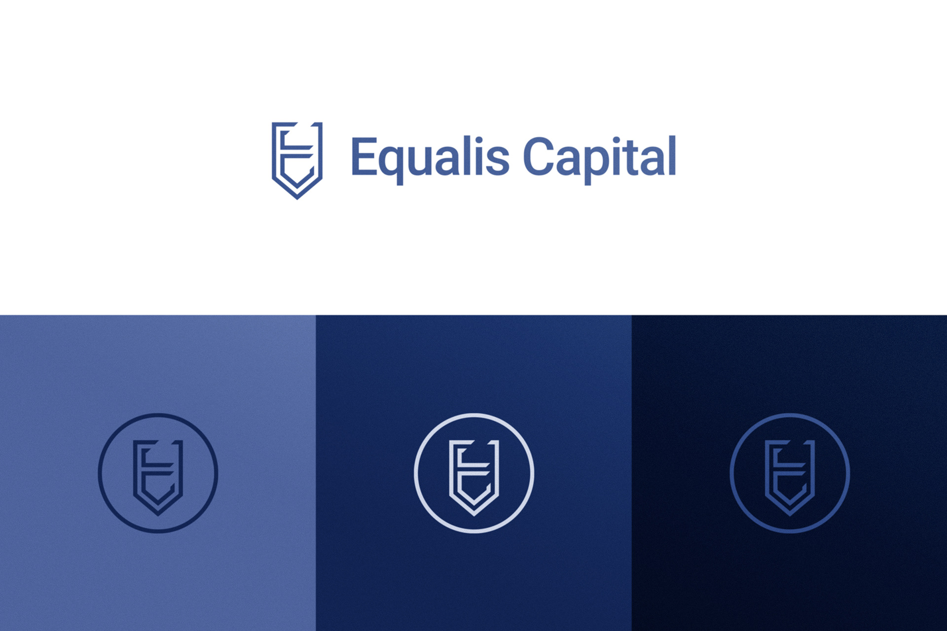
Taking cues from the etymology of "Equalis" (or aequālis, Latin for "equal"), we merged the letter E, the equal sign, and the mathematical symbol ∀ (meaning "for all") into a shield-shaped brandmark that symbolized security, equality, and inclusivity.
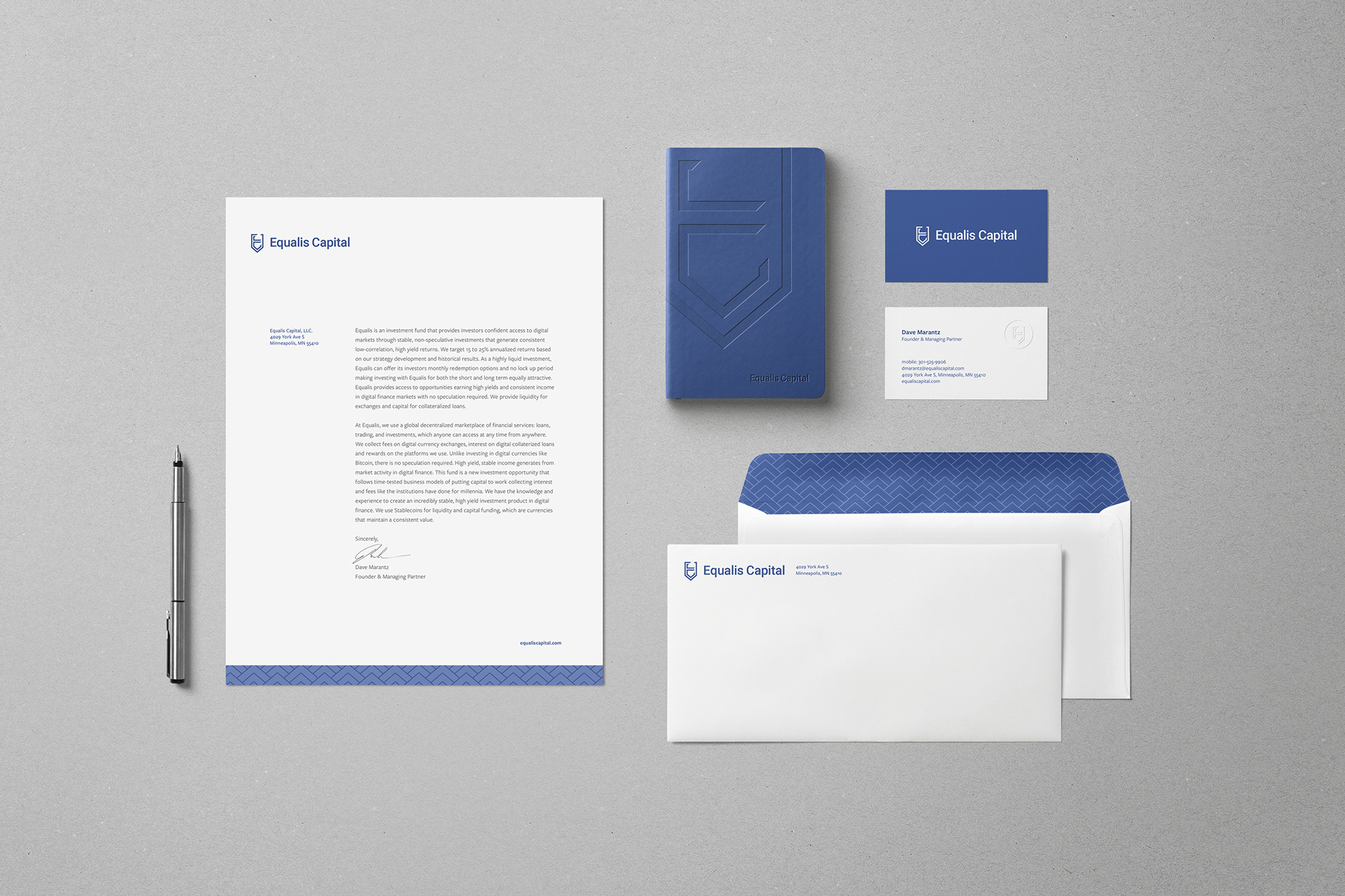
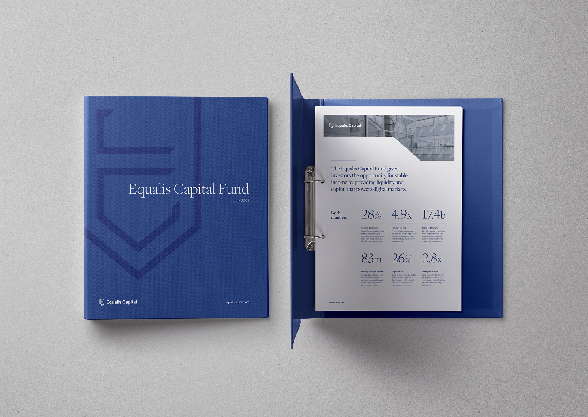
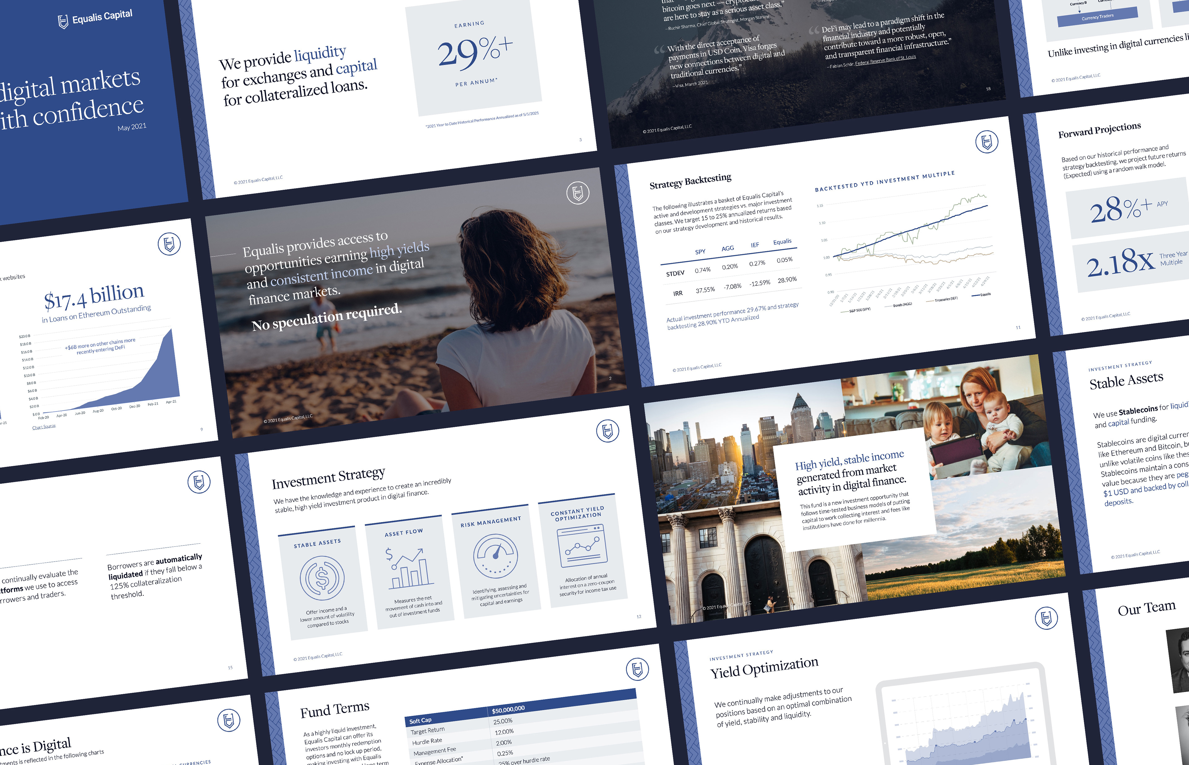
We then built out a new visual identity, including marketing materials, sales presentation template, and data visualization guides for regularly updating charts and visuals to keep current with projections. To expedite getting the brand public-facing, we designed and launched a landing page with one-page navigation to introduce visitors to Equalis Capital, with a high-level overview of who they are, what they offer, and how to reach them.